What 'Typical Retention' Cannot Tell You (And What Your Last 8 Videos Can)
The limitations of YouTube typical retention line: use the grey comparison line, then check traffic mix, viewer type, and your last 8 in-band videos before rewriting.

10 min readUpdated
In this guide
Typical retention is useful, but it cannot explain your video by itself. Use the grey line to find a timestamp, then compare your last 8 in-band videos, traffic sources, viewer mix, and unique viewers. If similar videos also have weak openings, the line is describing a pattern, not giving you a rewrite. The grey line is an instrument, not a strategy.
What Typical Retention actually is (and what it is not)
Typical retention is a comparison line in YouTube Analytics. The locked YouTube Help performance page says you can use typical retention to compare your 10 latest videos of similar length. That makes it useful for asking “where does this video differ from the comparison set?” It does not answer “why did viewers leave?”
Treat the line as a reference, not a grade. A video can sit below typical because its promise attracted a different audience, because viewers arrived from a different traffic source, or because the opening failed. Those are different problems with different fixes. A line that looks healthy can also hide a weak idea if the comparison videos are weak in the same place.
The phrase in-band video means a video serving the same audience, format, and job. Your last 8 in-band videos are not a published YouTube benchmark; they are a practical comparison set you build for your own channel. Keep the set coherent. Do not compare a long-form tutorial with a Short just because both have a retention chart.
| Instrument | What it can tell you | What it cannot tell you |
|---|---|---|
| Typical retention | Where this video differs from similar-length comparisons | The cause of a dip or the correct rewrite |
| Last 8 in-band videos | Whether the pattern repeats in your own format | A universal benchmark for every channel |
| Traffic and viewer context | Who arrived and how they found the video | Which sentence caused each exit |
Where RetentionYT fits
Manual diagnosis works alone. RetentionYT can shorten the script-review loop, but it does not turn a comparison line into a causal explanation.

Why this shows up in YouTube Studio
You open Studio because the line is attached to a specific video and a specific report. SOURCE 1 currently opens YouTube Help’s “Understand your YouTube video reach,” not a page titled Audience retention. It describes Reach reports, traffic-source reporting, and a note that some reports may not be available on mobile. That mismatch is recorded in the handoff; the article uses only claims visible on the locked URL.
SOURCE 2, “Understand your YouTube content performance,” says the Videos section includes “Key moments for audience retention,” and that typical retention can compare your 10 latest videos of similar length. It also lists reports for how viewers found content, new, casual, and regular viewers, unique reach, average view duration, and average percentage viewed.
Those reports give you context, not a magic explanation. The typical line answers a narrow comparison question. Traffic reports tell you how viewers found the content. Viewer reports describe audience groupings and reach estimates. Put them beside the curve before you edit your script.
When you inspect the page, write down the report name, the video length, and the timestamp you are investigating. If you are on mobile and a report is missing, do not infer that the data is zero. Mark it unavailable and continue with the evidence you can actually see.

Worked example 1: the failure
Here is an illustrative failure. Your tutorial dips below the typical line at 0:08, so you delete the first sentence and rewrite the middle. You do not check traffic source, viewer mix, or the last 8 in-band videos. The grey line becomes the whole diagnosis.
The line may be accurately showing a difference from the comparison set. But it cannot tell you whether viewers came from search with a precise question, from browse with a broad promise, or from an external link with different expectations. It also cannot tell you whether the comparison videos have the same weak opening.
Illustrative failure map: 0:08 is the chosen timestamp; 1 comparison line is checked; 0 traffic-source checks and 0 in-band comparisons are made. These are planning values, not YouTube data.
| Illustrative failure measure | Before fix | Rejection reason |
|---|---|---|
| Timestamp selected | 0:08 | A useful starting point, not a cause |
| In-band videos checked | 0 | No channel-specific pattern |
| Traffic/viewer context checked | 0 | Audience mix is unknown |
Worked example 2: the fix
Keep the same illustrative dip at 0:08. First, read the sentence spoken there and compare the promise with the title and thumbnail. Then review the last 8 in-band videos: same format, same audience, same job. Mark whether their openings show a similar shape. Do not call the result a benchmark; it is your working comparison set.
Next, check the available traffic and viewer reports. SOURCE 1 lists reports for how viewers found a video, including search terms, suggested videos, and playlists featuring the video. SOURCE 2 describes the Content tab, traffic sources, viewer groups, and key moments for audience retention. Use the reports you can access and record their names.
Now choose one rewrite. If the same promise fails across several in-band videos, rewrite the opening promise and test it on the next upload. If only one traffic source or one video differs, do not rewrite the entire channel from one grey line. The correction should match the evidence you actually have.
The fix is deliberately slower than cargo-culting the line. Those timings are illustrative workflow budgets, not YouTube performance claims.

How to check this in YouTube Studio (step by step)
First, open the video in Studio and select Analytics. Use the audience-retention report or key-moments report that your account exposes. YouTube Help says typical retention can compare your 10 latest videos of similar length; record the comparison context before you interpret the shape.
Second, mark one timestamp. Choose the first clear divergence, not every small wiggle. Write the spoken sentence, the on-screen promise, and what the viewer was supposed to receive at that moment. The line gives you a location to investigate, not a sentence to delete automatically.
Third, build your last 8 in-band set. “In-band” means same audience, format, and job. Note each video’s length, topic, traffic mix when available, and opening pattern. Eight is an illustrative working set for this method, not a YouTube rule or benchmark.
Fourth, inspect traffic and viewer context. SOURCE 1 describes traffic-source reports such as search terms, suggested videos, and external sites or apps. SOURCE 2 describes how viewers found content and reports for new, casual, and regular viewers, plus unique reach. Compare the groups you can actually see.
Fifth, choose one rewrite or one measurement. If the promise is unclear at the marked timestamp, rewrite that promise. If the audience mix explains the difference, keep the script and change the comparison. If similar videos are also weak, test the opening across the next upload rather than treating one line as a verdict.
Sixth, document the result. Save the date, timestamp, report names, comparison set, and decision. A future review can then tell whether the rewrite changed the pattern. Do not label your in-band set as “the YouTube average.”

The trap
The trap is treating a comparison line as a cause. Typical can show that your curve differs from a similar-length comparison group, but it cannot name the sentence, source, or viewer expectation responsible. A below-typical segment is a question mark with a timestamp attached.
Another trap is trusting a neat comparison set that is not actually comparable. Your last 8 videos may mix tutorials, Shorts, launches, and search answers. Call them “in-band” only when they serve the same audience and job. If the set is mixed, split it before you rewrite.
The final trap is ignoring the possibility that similar videos are also bad. A grey line can make a weak pattern look normal. Check the openings in your comparison set and use the available viewer and traffic reports. Do not publish a percentage as a benchmark unless the source actually states it.
The trap
The move

What to do in the next upload
Write the promise before you record, and decide what evidence you will review after publishing. Keep the method manual so it works without signing up to RetentionYT. Use the grey line to find a place, not to outsource the reasoning.
- Record the video promise and intended audience before publishing.
- Open Analytics and note the report name you actually see.
- Mark one timestamp where the curve differs from typical.
- Read the spoken sentence and check the title and thumbnail promise.
- Build a comparable set of 8 in-band videos.
- Keep format, audience, and job consistent in that set.
- Inspect available traffic-source reports.
- Check new, casual, regular, or unique-viewer context when available.
- Label every threshold or number as illustrative unless a source states it.
- Choose one rewrite instead of changing the whole script.
- Record the date, evidence, decision, and next test.
- Recheck the next upload without calling your set a universal benchmark.
For a focused script pass, use the related tool once after the manual diagnosis. For context, read related post 1 and related post 2. Use YouTube Studio to inspect what the published video actually reports.
The grey line tells you where to look; your context checks tell you what to rewrite.
Frequently asked questions
- Is the typical retention line enough?
- No. Typical retention is a comparison tool, not a diagnosis. YouTube Help says typical retention can compare your video with your 10 latest videos of similar length. Use it to spot an unusual shape, then inspect traffic source, viewer mix, and your last eight in-band uploads before rewriting.
- Why might typical be misleading?
- Typical can hide important context. Two videos may be similar in length but attract different viewers, traffic sources, or expectations. A grey comparison line can tell you that a moment is unusual relative to the comparison set; it cannot, by itself, tell you which promise, audience, or distribution path caused the shape.
- What else should I compare?
- Compare the current video with your last eight in-band videos, meaning videos serving the same audience and format. Then check traffic sources, new versus returning viewers when available, unique viewers, and the opening seconds. Treat those as diagnostic context, not as a universal YouTube benchmark.
- Does traffic source break typical?
- Traffic source can change the audience arriving at a video, so it can change the shape you are trying to interpret. YouTube Help describes reports for how viewers find content, including browse, suggested, search, and external sources. Compare like with like before blaming the script or the grey line.
- Should I ignore typical?
- Do not ignore typical; use it as an alarm. YouTube Help says typical retention can compare your 10 latest videos of similar length. The mistake is stopping there. Use the comparison to choose a timestamp, then investigate the promise, traffic mix, viewer type, and neighboring videos.
- How do I apply “What 'Typical Retention' Cannot Tell You (And What Your Last 8 Videos Can)” on my next upload?
- Record the video promise, format, length, and intended audience before publishing. After data appears, compare the retention curve with the typical line, then review eight comparable uploads and the available audience and traffic reports. Rewrite one moment at a time, and label every illustrative threshold as a working rule.
- Where in YouTube Studio do I check “What 'Typical Retention' Cannot Tell You (And What Your Last 8 Videos Can)”?
- This is a decision framework, not a named Studio report. Open the video in YouTube Studio, select Analytics, and use the audience-retention and reach or content reports available to your account. YouTube Help says some reports may not be available on mobile, so record the actual report names you see.
- What is the most common mistake with “What 'Typical Retention' Cannot Tell You (And What Your Last 8 Videos Can)”?
- The common mistake is treating the typical line as a verdict. It is a comparison against similar-length videos, not a causal explanation. A better review names the timestamp, checks the traffic and viewer context, compares eight in-band videos, and changes the first sentence or promise only when the evidence points there.
Give your next script a second look
Paste a script into RetentionYT for suggestions on your hook, pacing, and structure. Choose the edits that serve your video, then check audience behavior in YouTube Analytics after publishing.
Get retention tips in your inbox
Occasional, practical emails on hooks, pacing, and retention. No spam.
Related posts
Key Moments in Studio: Intro, Top Moments, Spikes and Dips
Decode YouTube Studio key moments with a practical timestamp method: keep spike lines, rewrite dips, and turn the intro label into a sharper first-30-second promise.
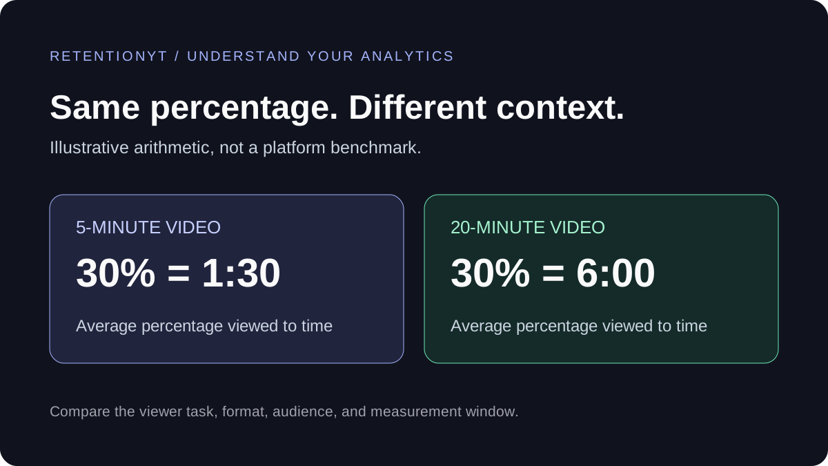
What Is a Good YouTube Audience Retention Rate?
A retention percentage needs context. Compare similar videos, separate intro retention from average percentage viewed, and find one useful change for your next script.
How to Read Your YouTube Retention Graph (and Fix What It Shows)
Your YouTube retention graph is a line-by-line map of where viewers left. Learn to read every dip, cliff, and spike — and fix each one with concrete script and edit techniques.