YouTube Retention Benchmark 2026: What the Numbers Actually Mean
There is no official YouTube retention benchmark. Here is what YouTube Studio actually reports, why third-party benchmark tables mislead, and how to build a baseline from your own channel.

10 min read
In this guide
Someone in a comment section will tell you 50% is good. Someone else will tell you their channel averages 35% and grows fine. Both can be true, because "good retention" without a length, a niche, a traffic source, and a curve shape attached is not a fact — it is a vibe.
So let us be blunt about what this post is. It is not a table of 2026 median retention by niche. We will not publish one, because we cannot source one honestly: YouTube does not release that data, and the numbers circulating online are third-party samples presented with far more confidence than they earn.
What you can have instead is better: a clear reading of what YouTube actually reports, and a benchmark built from your own channel that no one can inflate.
What YouTube actually gives you
Open YouTube Studio, pick a video, and go to Analytics → Engagement. The Audience retention report is the primary source, and it contains three distinct things that people routinely blend into one:
Average view duration. The raw time viewers spent, in minutes and seconds. This is the number closest to what the recommendation system trades in, because watch time is duration multiplied by views.
Average percentage viewed. That duration expressed as a share of the video's length. It is the number people mean when they say "my retention is 43%", and it is only comparable between videos of similar length.
Relative audience retention. YouTube's own comparison of your video against other YouTube videos of similar length, shown as above / average / below average across the timeline. This is the closest thing to an actual benchmark that exists, and it is the one creators ignore in favour of a number from a blog post — including, historically, ours.
There is also the retention curve itself, plus the "key moments for audience retention" markers that flag spikes and dips. The curve carries most of the useful information; the headline percentage is a summary of it that discards the shape.
Everything above is first-party, documented in YouTube's own Help pages for the Audience retention report, and visible in your Studio account. That is the entire universe of official retention data available to a creator. Notice what is missing: any table telling you what a "normal" percentage is for cooking, finance, or gaming videos in 2026.
Why third-party benchmark tables mislead
Benchmark tables are popular because they answer the question people want answered. They mislead for reasons that have nothing to do with bad faith:
- Length is not controlled. 30% of a 15-minute video is 4:30 of watch time. 60% of a 3-minute video is 1:48. The lower percentage delivered more than twice the watch time. A table that sorts by percentage rank-orders those two backwards.
- Traffic source is not controlled. The same video pulls very different curves from Search (high intent, arrived deliberately), Browse (low intent, scrolling), Suggested (mid-video interest), and External (came from a link and may bounce instantly).
- The sample is self-selected. Vendor data reflects that vendor's customers. Screenshot threads reflect creators who felt good enough about a number to post it.
- "2026" usually means "we changed the title." Retention reporting did not become newly standardized this year; a year in the title is a freshness signal, not new evidence.
Our own earlier post on what counts as a good retention rate quotes rule-of-thumb percentage ranges. Read them as exactly that: unofficial rules of thumb collected from creator reporting, not platform figures, and not targets to be judged against. They are a rough orientation for someone who has literally no reference point. Once you have three videos of your own, your own data is strictly better.
Build a benchmark you can defend
The honest replacement for a benchmark table is a baseline sheet. It takes about twenty minutes to build and it is real.
List your last ten to fifteen videos and record, for each one, the columns below. Leave the cells you cannot fill empty rather than estimating them.
| Column | Where it comes from | Why it is in the sheet |
|---|---|---|
| Video length | Studio | Percentages only compare within a length band |
| Average view duration | Audience retention report | The watch-time number |
| Average percentage viewed | Audience retention report | The headline ratio |
| Relative retention (above / average / below) | Audience retention report | YouTube's own comparison |
| Retention at 0:30 | Curve, read off the graph | Isolates hook vs body problems |
| Top traffic source | Traffic source report | Explains most curve differences |
| Format | You | Tutorial, story, vlog, list — they behave differently |
Then group the rows into length bands — for example under 5 minutes, 5 to 12, over 12 — and take the median of each band. Those medians are your benchmark. When a new video comes in, you compare it with its own band, not with a stranger's average.
Two practical notes. Keep at least three videos in a band before you trust its median; with one video the median is just that video. And date the sheet — a baseline from a year ago describes a different channel, and probably a different you on camera.
Read the curve, not the average
Two videos can both report 42% and be entirely different problems:
- One holds nearly everyone through the first minute, then declines slowly and evenly. The opening worked; the middle ran out of reasons to stay. That is a structure and pacing fix.
- The other loses a large share of viewers in the first fifteen seconds and then holds almost flat. The opening broke the promise the title made; everyone who stayed got what they came for. That is a packaging and hook fix.
The average cannot tell those apart. The curve can, in about five seconds of looking. The method for reading one — where to look, which dips are meaningful, which are just chapter boundaries — is in how to read a YouTube retention graph.
Three shapes worth naming, because they map to different work:
The cliff. A steep drop in the opening seconds. Almost always a promise mismatch: the thumbnail and title set an expectation that the first two sentences did not confirm.
The slide. A steady decline with no recoveries. Nothing in the video ever re-earns attention — no new information, no change of scene, no open question. Interest was spent in the first minute.
The sag and recover. A dip followed by a rise. Usually good news: viewers skipped a section and came back. Find what they skipped, and cut it next time.
A rising segment is not necessarily a triumph, either — it can mean viewers scrubbed backwards because something was unclear. Check the section before the rise before you celebrate it.
Segment by traffic source before you conclude anything
This is the step that changes conclusions most often, and it costs one click. Split the same video by traffic source and the "bad retention" verdict frequently dissolves: a video that looks weak overall may be holding Search viewers well while Browse impressions drag the average down. Search viewers typed something and arrived on purpose; Browse viewers were handed a thumbnail mid-scroll.
The action differs accordingly. Weak Search retention means the video did not answer the query it ranked for. Weak Browse retention with healthy Search retention is often a packaging problem, not a content problem. Same percentage, two different jobs, and the benchmark table on some other site cannot distinguish them.
Watch time versus percentage matters here too, and watch time vs retention covers the trade-off in full: a long video with a middling percentage can be the better performing video in absolute terms.
What you can benchmark before the video exists
Here is the honest boundary of pre-record tooling, using our own product as the example.
Take a script for a 12-minute explainer that you have not filmed. There is no retention number for it. There cannot be — retention is produced by a thumbnail, a title, a traffic source, a delivery, and an edit, none of which exist yet. Any tool that hands you a predicted percentage at this stage has invented it.
What a pre-record audit can do is check the things that are already decided on the page. Pasted into RetentionYT, a script comes back with structural findings: whether the first lines confirm the title, where the first real payoff starts, which sections are dense with claims and thin on delivery, where a visual cue is missing, and a verdict of record / fix first / rewrite. On a recent draft of ours the useful finding was position, not prose — the payoff the title promised did not begin until roughly a third of the way in, which is precisely the shape that produces a slide in the curve.
The fix was structural: move a concrete example from the middle beat up into the first ninety seconds, and cut the setup paragraph it displaced. Then re-audit. That is the whole loop, and it is a loop about structure, not a prediction of a number.
After publishing, the two halves connect: compare the actual curve against the structural findings you accepted or ignored. If you ignored a "payoff starts late" finding and the curve slides from minute two, you have learned something specific about your own writing — which is worth more than any median in a table. The viewer retention checker page describes what the pre-record check covers, and where it stops.
A workflow that does not require invented numbers
- Build the baseline sheet from your own last ten to fifteen videos, grouped by length band.
- For each new video, read relative audience retention in Studio first. It already controls for length.
- Read the curve shape and classify it: cliff, slide, or sag-and-recover.
- Split by traffic source before drawing any conclusion.
- Turn the diagnosis into one structural change in the next script — not five.
- Audit that script before recording, then compare the published curve with what the audit flagged.
Nothing in that list needs a benchmark from someone else's channel. Every input is either your own analytics or your own document.
What we deliberately did not put in this post
No median retention percentage by niche. No "average YouTube retention in 2026". No case study with a before-and-after percentage attached to it. Those numbers would make this post more shareable and less true — and a creator who plans a channel around a number we invented would be worse off for reading us.
If you want a rough orientation range while your own sheet is still empty, the good retention rate post has the commonly quoted ones, clearly labelled as unofficial. Use them for a week. Then use your own.
The part you can control today is the script. Create a free account, paste the draft you have open, and fix the structure while it is still a document — that is the only retention work that costs nothing when it turns out you were wrong.
Frequently asked questions
- Does YouTube publish official retention benchmarks by niche?
- No. YouTube Studio's Audience retention report gives you your own average view duration, average percentage viewed, and a relative audience retention comparison against other YouTube videos of similar length. YouTube does not publish a public table of median retention by niche, so any 'benchmark by category' figure you find online is a third-party sample or a survey of self-reported numbers — useful as background, never as a target.
- Where do the retention benchmark numbers on other sites come from?
- Usually one of three places: a tool vendor's own customer data, a scrape of public estimates, or creators sharing screenshots. Each has real limits — vendor data reflects who buys that tool, scrapes cannot see private analytics, and screenshots are self-selected toward good results. None of them is a platform figure, and none controls for your video length, traffic mix, or topic.
- What should I compare my retention against instead?
- Three things, in order: your own videos in the same length band, the relative audience retention line in YouTube Studio for that specific video, and the same video split by traffic source. Those three are first-party, they control for the variables that matter, and they cannot be inflated by someone else's sample.
- How many views before a retention number is trustworthy?
- There is no published threshold, and anyone quoting one is guessing. The practical test is stability: check the number on the same video across several days and see whether it is still moving. Early views are dominated by subscribers and notifications, so retention usually drifts as broader traffic arrives — treat it as provisional until it stops moving.
- Can I compare Shorts retention with long-form retention?
- Not usefully. A short loops and is measured over seconds; a long-form video is measured over minutes and includes intros, chapters, and mid-video decisions. Keep two separate baselines and compare each format only with itself.
- Does a script auditor predict my retention percentage?
- No, and you should distrust any tool that claims it does. Retention depends on packaging, thumbnail, traffic source, delivery, and edit — none of which exist while the script is a document. A pre-record audit checks structure: whether the opening confirms the title, where payoffs land, which sections are dense or repetitive. That is a different and honest job.
Give your next script a second look
Paste a script into RetentionYT for suggestions on your hook, pacing, and structure. Choose the edits that serve your video, then check audience behavior in YouTube Analytics after publishing.
Get retention tips in your inbox
Occasional, practical emails on hooks, pacing, and retention. No spam.
Related posts
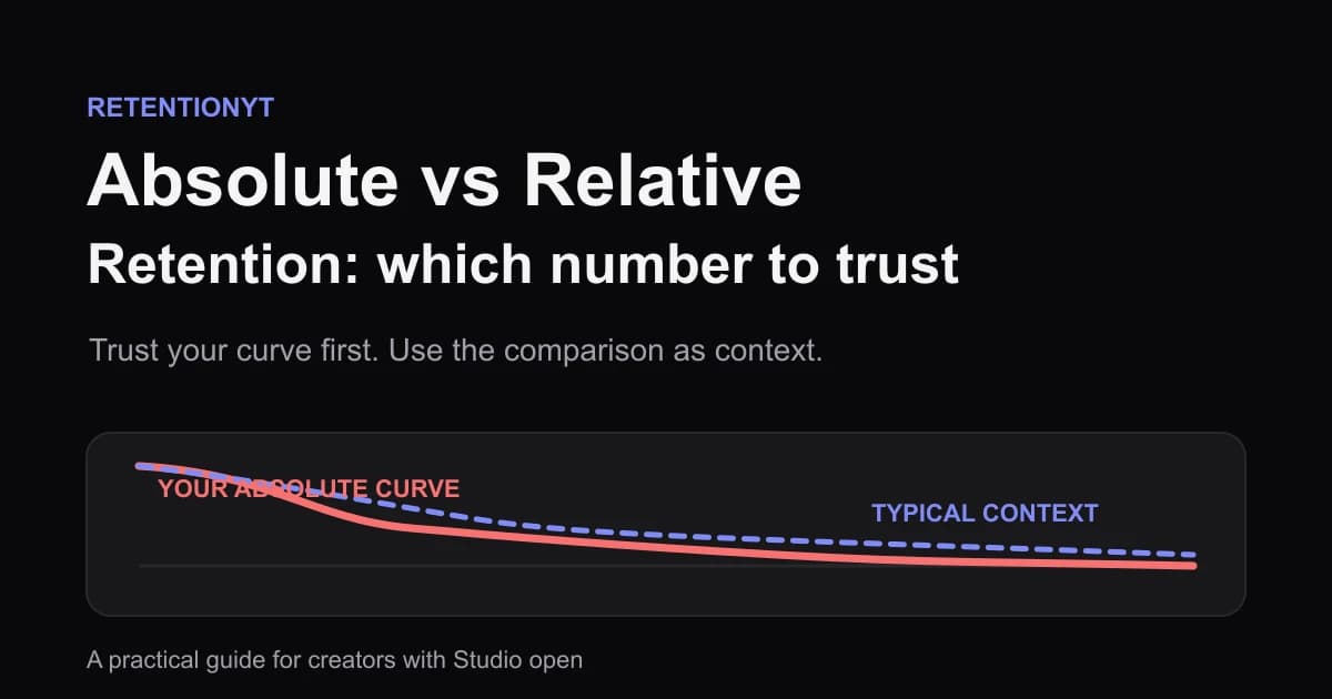
Absolute vs Relative Retention: Which Number to Trust
Absolute vs relative audience retention on YouTube: read the cliff, use typical retention correctly, and fix your first 30 seconds before chasing a benchmark.
How to Benchmark Retention Against Your Own Length Band
A YouTube retention benchmark by video length should start with your own channel: compare the last 8 videos in a similar length band, not a global chart.
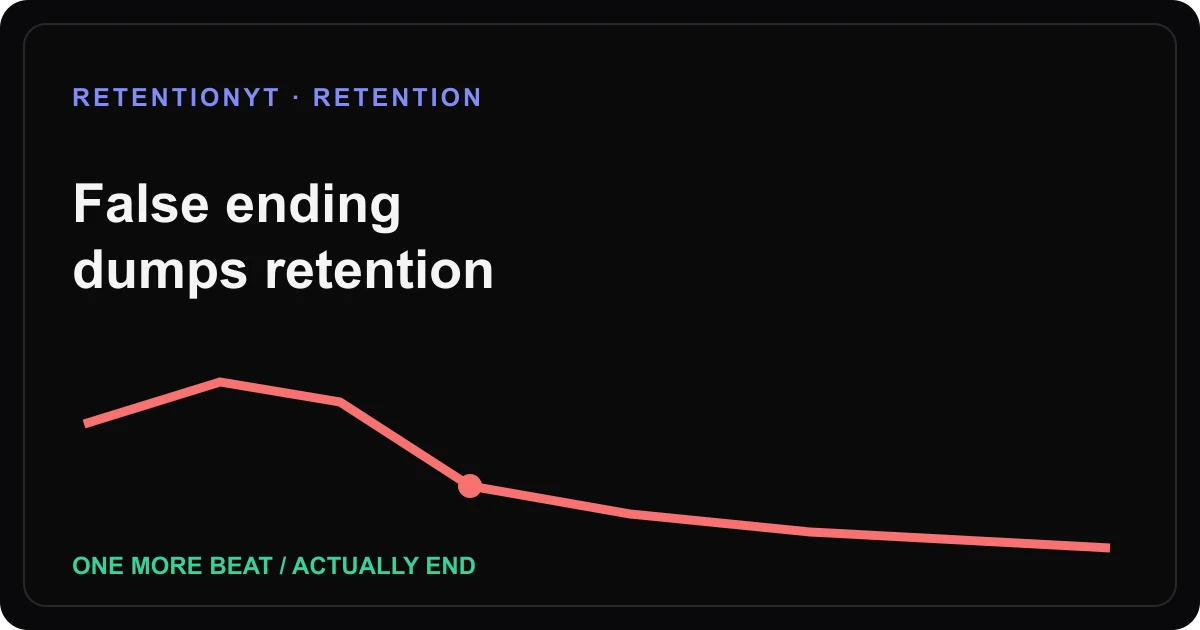
False Ending That Dumps Retention
Fix the YouTube fake-out ending that triggers a retention drop: mark the cue, read the transcript, and choose one more beat or actually end.